Protective Industrial Products
Website Redesign
THE PROJECT
Protective Industrial Products is a global safety products manufacturer with an extensive product catalog. Subtle differences between the products can make all the difference for proper protection in a worker's environment. Several selector guides had been developed to aid in this, but we wanted to make sure that users were able to find the right product and understand why it would be the best fit for what they need. Previously, I was tasked to develop a completely separate mobile experience for the website, but it was time to revisit the fixed container environment of the desktop experience.
ROLE: Research, Design, Development
TIME: Started Fall 2016, initial launch in Fall 2017
MAIN OBJECTIVES

Create responsive layout with flexible templates available for consistently adding new content
Refresh design without completely disrupting the navigation that daily users were accustomed to
Offer clear and concise education on safety standards and technology to aid users in product selection
Develop a faster and easier path for users to find and select the products they need
THE PROCESS
PIP's website was completely custom built from the ground up. The goal was to leave as much of this php base intact as possible, but I did want to go through refactoring the files, mainly to root out excessive inline styles and switch some complex if/else conditions over to switch statements.
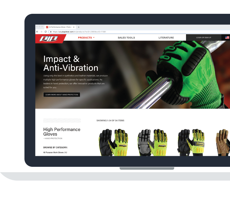
Using heatmaps, we determined that the most used path on the website by far was the "Products" link in the main navigation. This took users to a landing page containing a list of products by category in the sidebar, or a slider offering the ability to filter products by their occupation's channel. This format demanded multiple clicks and page loads before users were even getting close to the final product they were searching for. I wanted more steps forward available directly from any page in the header without another page load, more like the functionality that I implemented on the mobile side.
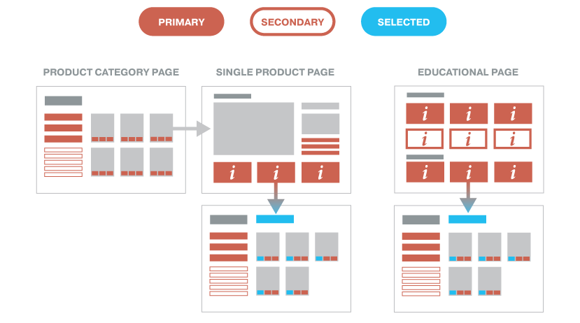
We had recently worked on adding custom filters specific to each product subcategory, which were kept as static information in a series of include files. I wanted to build on this to facilitate product selection and add to product education. I began going through all of our catalogs and spec sheets to pull descriptions for every attribute that was appropriate to describe in further detail, and moved all of this information out of the include files and into our database. I coordinated a project for a few other members of the design team to help create thumbnail images for each attribute as well, since this was a fairly massive undertaking.
THE RESULT
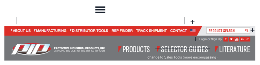
A fixed navigation that retained the three main links of our old site allows for users to continue their use of the site without too much of an adjustment. The country and login links have been given more prominence on the page, now that there is more content offered for both options. The search bar also stays in the same general area. The extraneous top navigation has been condensed into a hamburger dropdown, and can also be found in the footer.
The new product menu allows users to get closer to their final selection much faster. However, if they do want to keep starting from the product landing page, a second click on the products link, or a 'browse by' selection will still bring them to that option. This page now shows all four main avenues of selection: Category, Channel, Brands, and our Selector Guide tools. The power brands that previously existed along the footer got a home on this page, showing all educational and marketing pages that are associated with them.
We have received a lot of positive feedback on the filter loops, and continue to engage our product specialists and sales team for feedback and suggestions. We have also seen an increase in users to the website in general, currently at a 28% increase between the launch in September 2017 and the beginning of 2019.