Protective Industrial Products
Mobile Website
THE PROJECT
PIP's website was designed specifically for desktop, which was the platform for the vast majority of their initial users. It was mobile and touch friendly, but by 2015, this was not good enough anymore. The sale force needed an actual vertical mobile experience to present to customers when they were out on the road, with faster avenues to products and resources. The platform needed to continue the main goal of the desktop experience, to educate users, since there is no e-commerce aspect to the website.
ROLE: Research, Design, Development
TIME: Started June 2015, initial launch in May 2016
LINK: View Project Here
MAIN OBJECTIVES

Determine the highest priority content for users, and remove unnecessary clutter
Develop a new layout specific to a vertical mobile format
Recreate the navigation and menu paths to become more efficient, especially through products
Offer clear and concise education on safety standards and technology to aid users in product selection
THE PROCESS
It was decided that we would take an "adaptive" rather than responsive approach to building the mobile website. It would use the same product databases, but operate out of different core files and folders, leaving the destop side untouched. This would mean that any new content added to the website would need to be created twice, in two separate experiences.
My first task was to come up with mockups with the layout. My main focus was to get the product gallery and item pages to be as efficient as possible, without being too far of a departure from the functionality that desktop users were accustomed to.


Once the mockups went through rounds of reviews and were approved, I moved on to the development stage, duplicating and rewriting the existing php files into the new mobile structure.
THE RESULT
The index page pulls from the desktop homepage slider driven by the weekly email and social media campaign focus, usually on a specific product or channel. These alternate with sliders of links to direct users to the product brands they know, the channel they operate in, web apps, and educational pages.
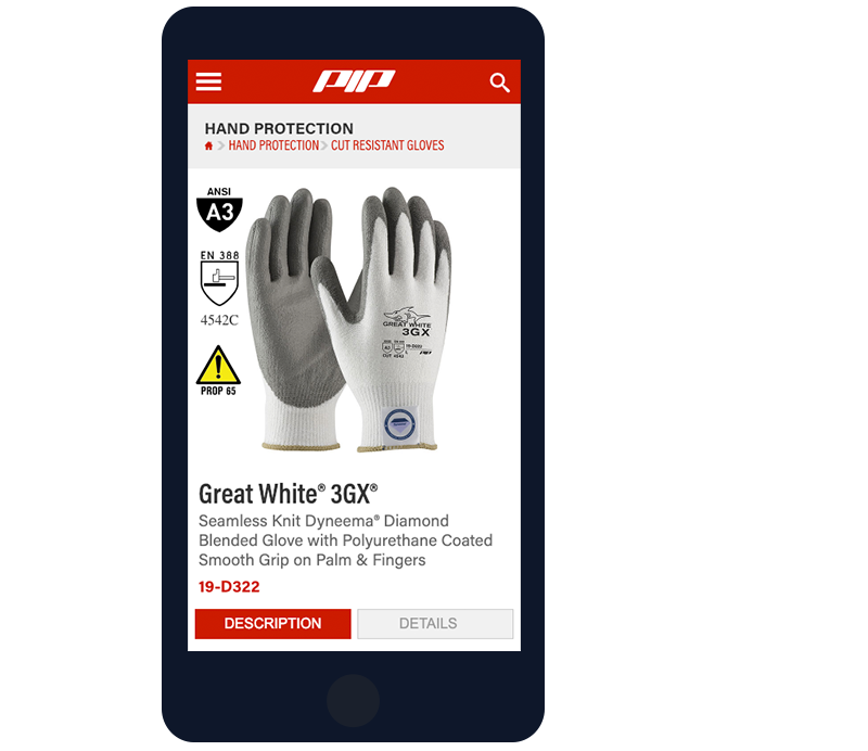
The top two levels of the product tree serve two random products per category and "View All" link. These are hardly used, since the product menu drivers users straight to the third level, and closer to a final item selection. I was able to retain the filter system of the product galleries without being too instrusive as collapsable section at the top, and I updated all of our product tooltip icons from low-res raster images into an svg icon font.
We have seen an increased percentage of about 37% more users utilizing the website on mobile devices from 2017 to 2019. However, the adaptive strategy was far from perfect. As of the end of 2018, I have been rewriting all of our files to consolidate into a fully responsive format.